SchoolSoft is Sweden's most widely used online school platform, providing timetables, lunch menus, grades and a lot more. However, I, and many other students and teachers that I’ve talked with, have noticed several problems with its user experience.
I created this unofficial redesign of SchoolSoft's mobile app to explore how I could improve its usability and aesthetics. These are some of the main problems I addressed:
- The Home and Settings pages are underused and could instead simplify access to relevant information.
- The screen for reporting absence is unclear for students under 18 years old (I’ll explain why).
- The screen for viewing assignment feedback is very empty and requires opening a website to see grading and other core information.
- The app looks outdated and is lacking in colour contrast and font sizes, making some areas difficult to glance over or read at all.
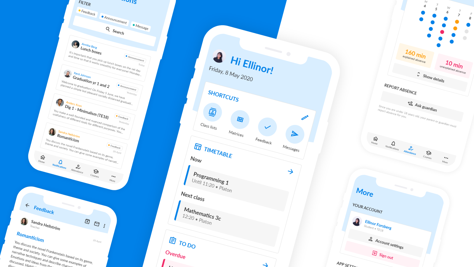
Home
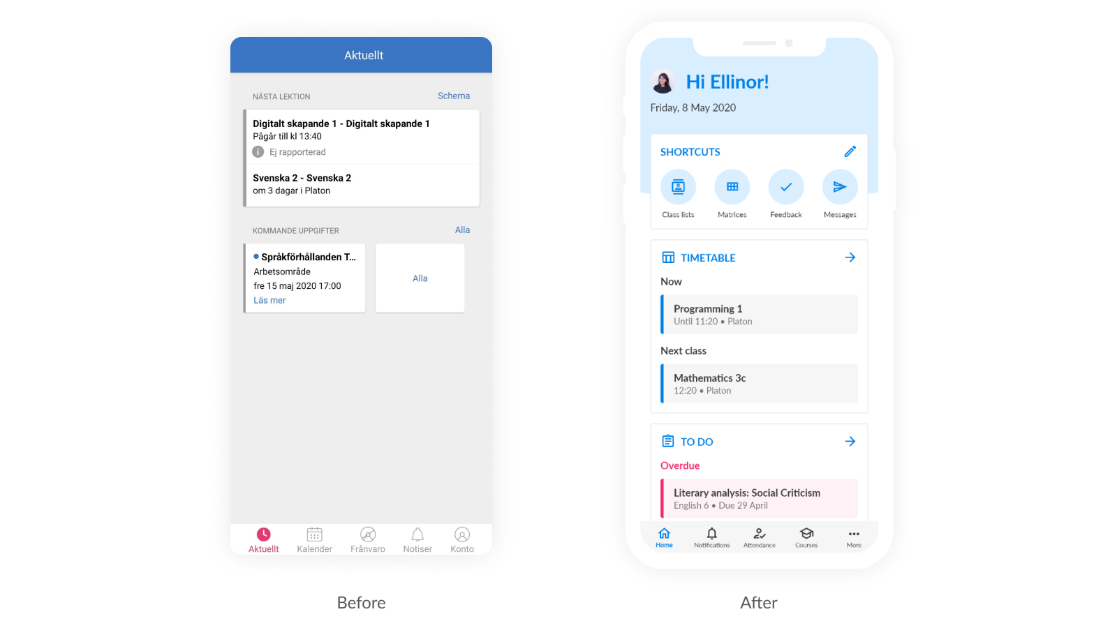
Improving the flexibility of the Home screen, I added customizable shortcuts to quickly jump to parts of the app. Because SchoolSoft houses so much information, different schools and users use different sets of features, so customizability makes sense. I also improved colour contrast and made elements stand out more using colour and spacing, making the Home screen easier to skim through.
Settings
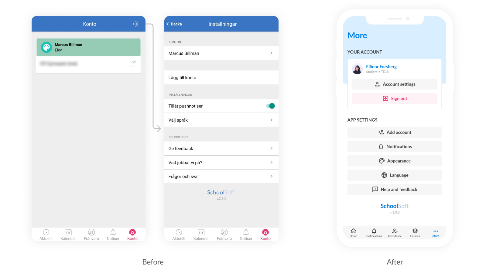
Currently, you access SchoolSoft’s settings by going to the empty-looking Account tab and then tapping the cog icon in the top-right corner. I combined the two screens into one simplified layout, and prepared for future sub-menus.
Assignment feedback
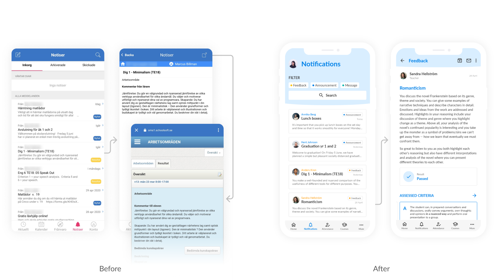
Another major problem was how the app displayed assignment feedback from teachers. The app only shows the raw message and requires tapping an icon in the top-right to view the rest (including grading) in a browser. This made it easy to miss important information from teachers.
To combat this clunkiness, I designed a new screen for notifications like assignment feedback. Everything is instantly visible, including grading and assessed criteria (an important part of the Swedish school system). I also improved text readability and colour contrast, especially for the yellow “Feedback” tag.
Attendance/absence
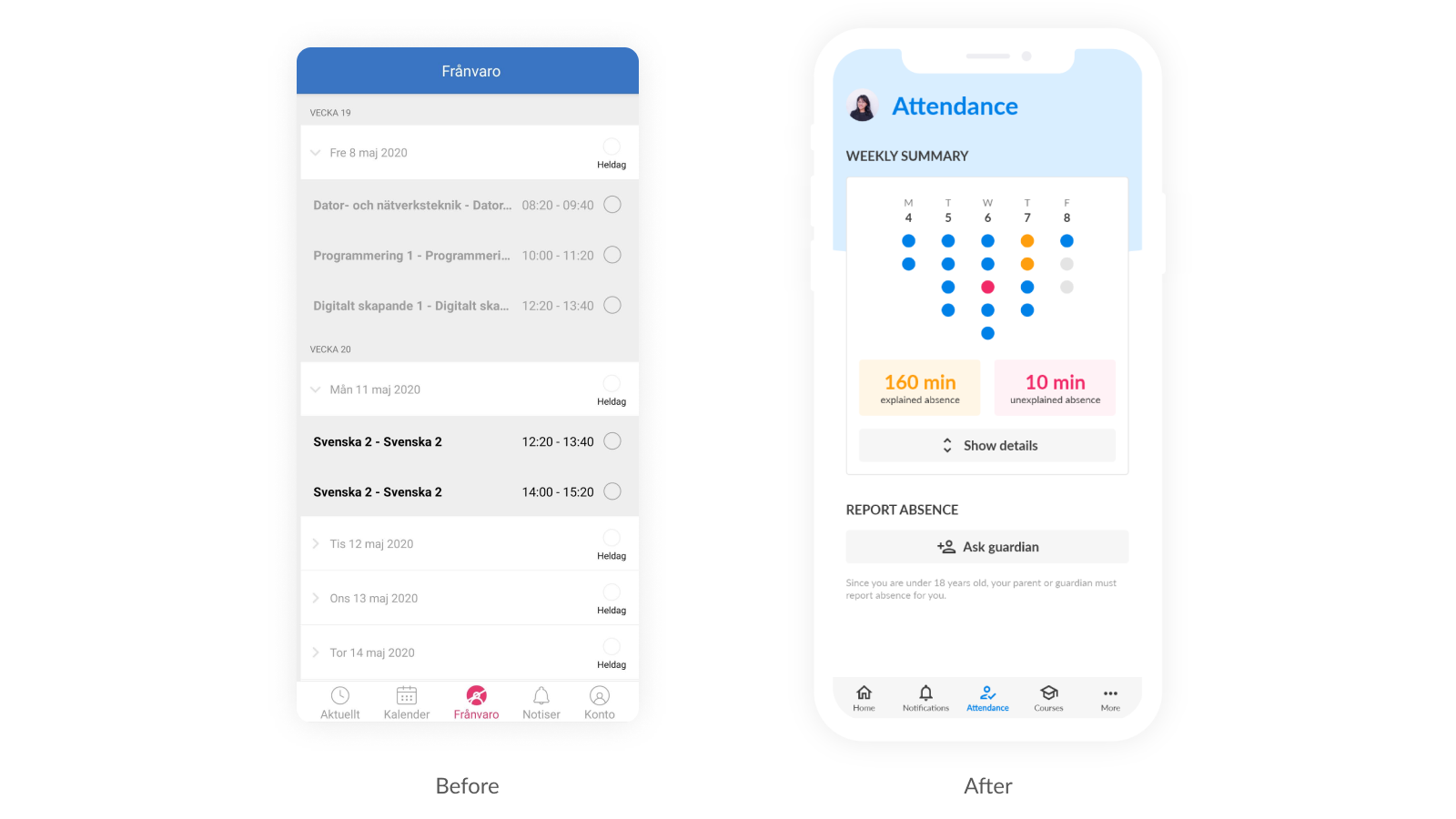
Another major problem was how the app displayed assignment feedback from teachers. The app only shows the raw message and requires tapping an icon in the top-right to view the rest (including grading) in a browser. This made it easy to miss important information from teachers.
To combat this clunkiness, I designed a new screen for notifications like assignment feedback. Everything is instantly visible, including grading and assessed criteria (an important part of the Swedish school system). I also improved text readability and colour contrast, especially for the yellow “Feedback” tag.
Conclusion
For my redesign, I brought the most important information and features to the forefront. I incorporated design elements like fonts and colours from the company's official landing page, but added some modern flair to the visual style. The result is a more structured, usable and accessible experience that feels more modern. This concept is part of what I think a great school platform could be.