- Date
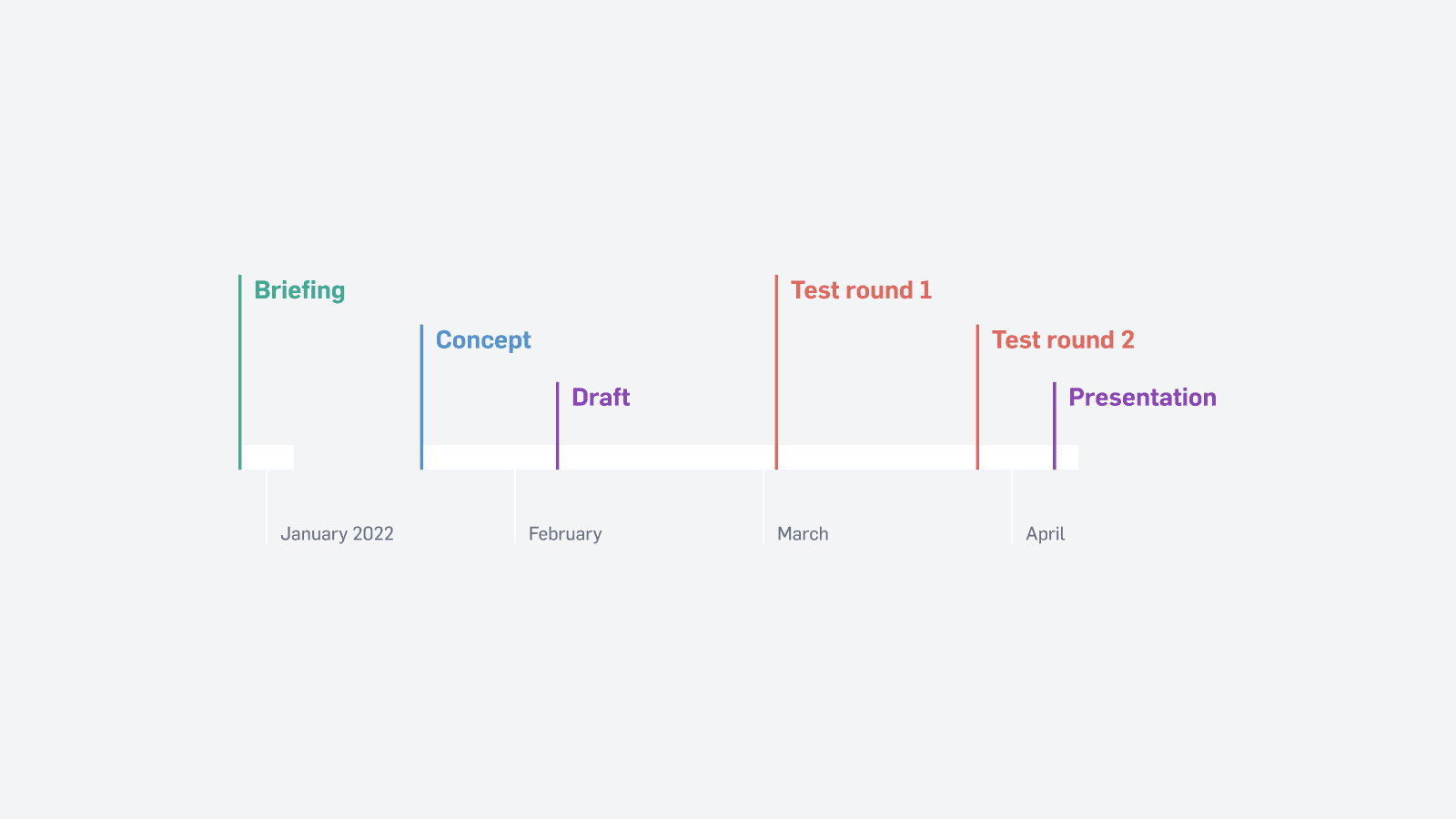
- Dec 2021–Apr 2022
- Skills used
- UX research •
- UI design •
- Design systems •
- Public speaking
During my internship at a biotech company from December 2021 to April 2022, I was tasked to design the UI for an upcoming medical analysis device. This semi-automatic coagulation analyser features unmatched performance, a disruptive feature set, and an intuitive touch screen experience. The 14-week project involved competitive analysis, information architecture, UI/UX design, user testing and presentation.
Note: This case study has been redacted to not contain classified information, including names of products and affiliated companies. More details and reference is available upon request.
A coagula-what?
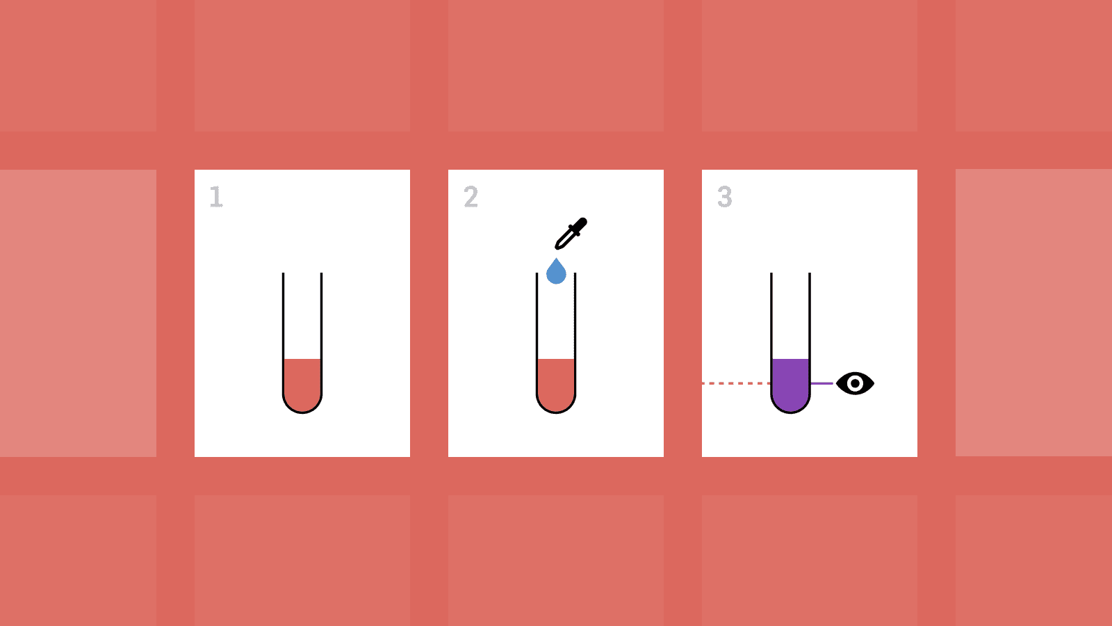
Coagulation testing is a way to diagnose a patient by measuring substances in their blood as it coagulates.
A sample of the patient’s blood is mixed with a liquid called a reagent, which triggers chemical reactions that make the blood plasma thicker (it coagulates). The coagulation analyser shines a beam of light through the plasma to measure how it’s affected by the reagent over time. As the plasma thickens, less and less light passes through.
One common use of coagulation testing is measuring blood clots. If you get one (or are about to), your body releases a substance called D-dimer into your bloodstream. At the hospital, a coagulation analyser measures how long it takes for your plasma to coagulate. This time shows the amount of D--dimer in your blood, which reveals the size and timeline of the blood clot—invaluable information to your doctor when deciding on treatment.
The mission
There are two kinds of coagulation analysers, one takes up half a room, and the other fits on a table. The latter kind (the semi-automatic coagulation analyser) is in dire need of innovation.
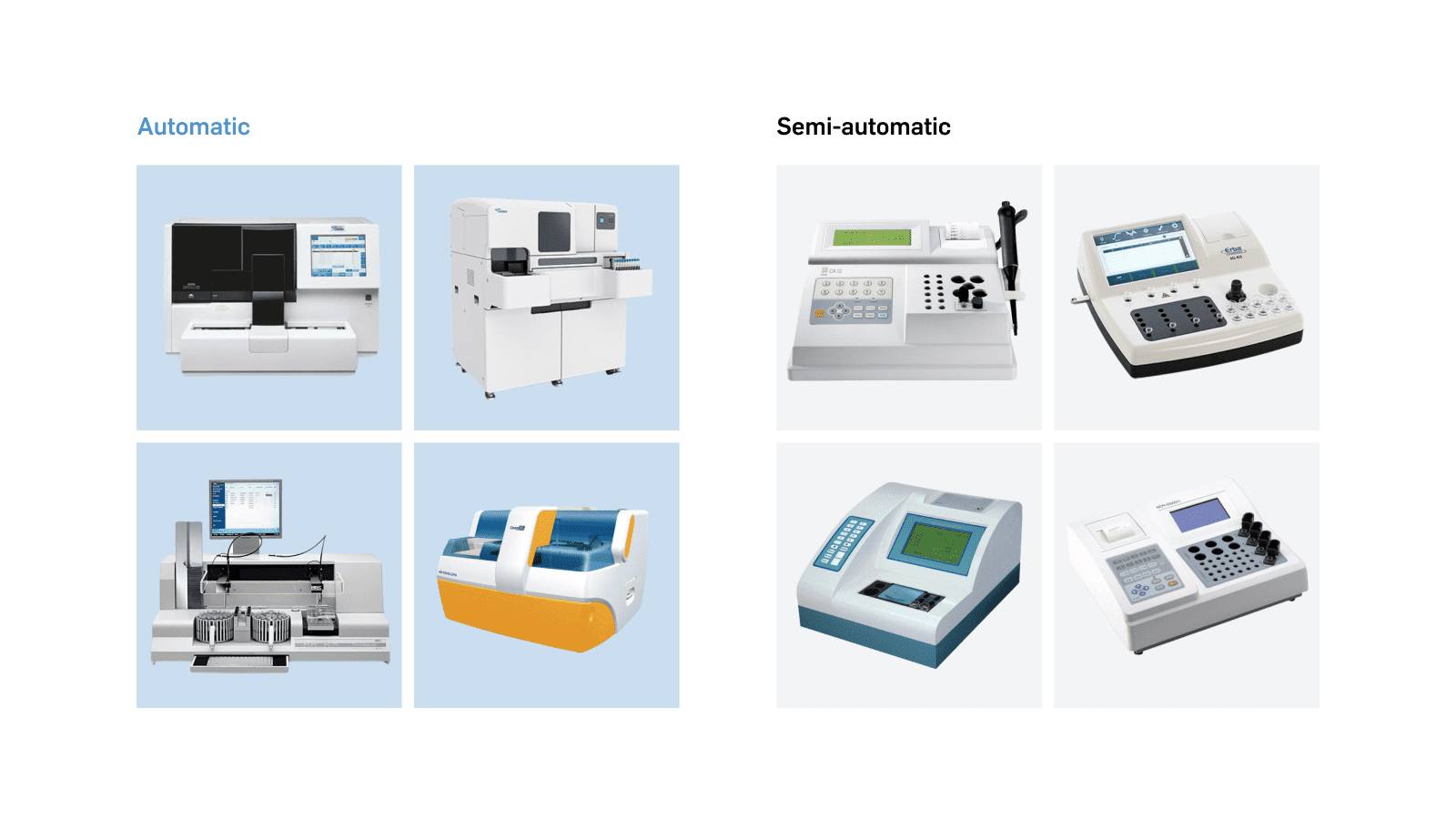
Most existing semi-automatic coagulation analysers are either lacking in functionality or look and function like a TI-82 graphing calculator from 1993. This new analyser can run more types of analyses with higher accuracy while being easier to use, safer, and less expensive. And it feels like a device from the current decade.
My mission was to design a UI from the ground up that captures this vision. Both novice and seasoned lab staff should be able to run analyses, follow them in real-time, check results, view instructions, calibrate the device, track reagent stock, and more.
Briefing
The project began with learning the basics of coagulation testing and the analysers available on the market. This included hands-on demonstrations of the analysis process in the company’s private labs, as well as walkthroughs of analysers from different manufacturers.
This gave me a feel for how these devices are used and which features, screens and UI patterns are most important—and what I could do better.
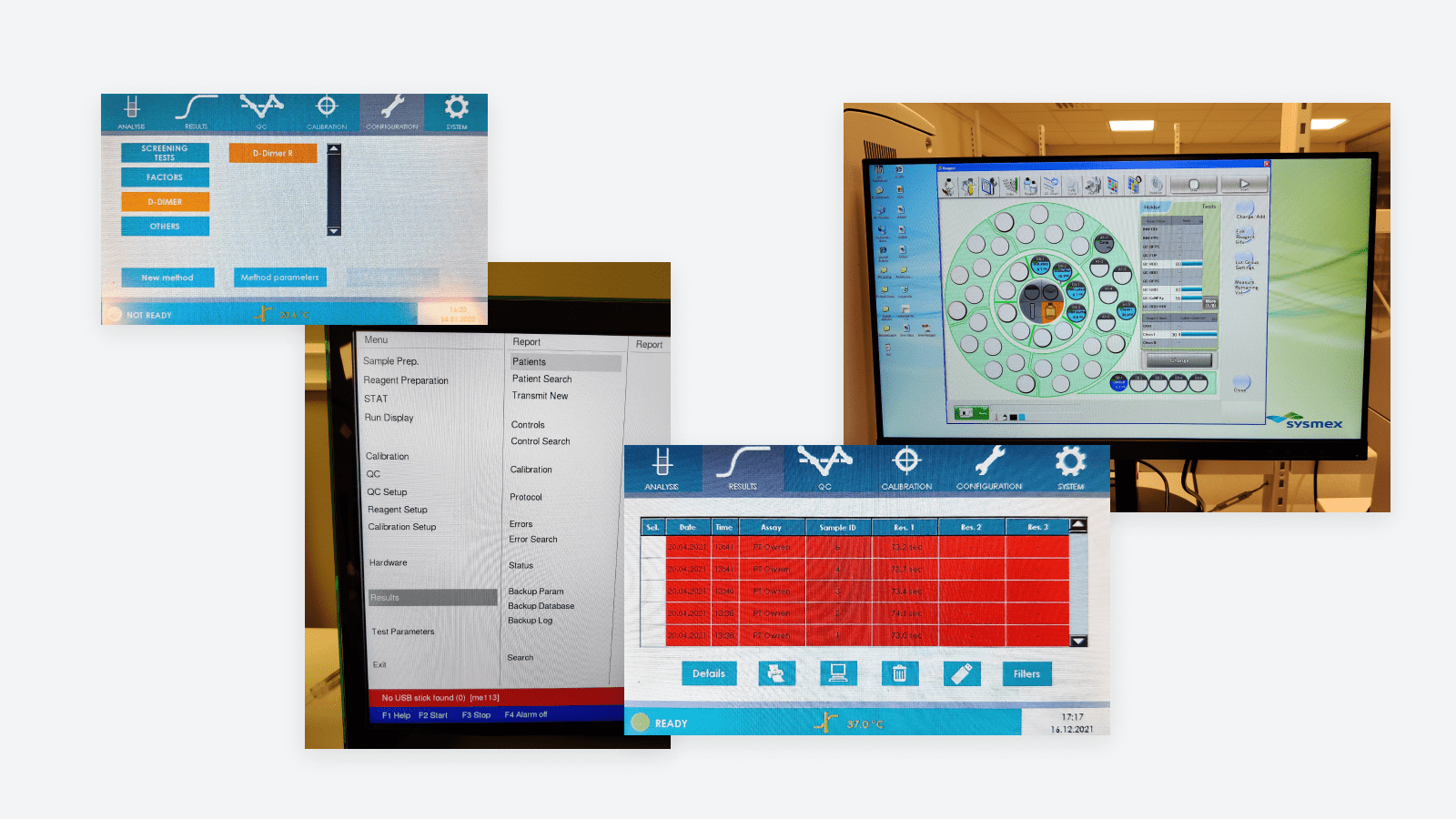
I noticed these core pain points in competing semi-automatic analysers:
- Usage involves many manual steps, such as precise pipetting, memorising instructions and handling patient samples. The human factor brings safety risks for both the patient and staff.
- They lack intuitiveness, for example by needing to memorise sequences of poorly labelled buttons and menu options. This distracts from the already risk-filled analysis process and requires unnecessary training.
- Functionality is lacking, such as reaction curves and warnings in the event of measurement errors.
Based on those problems, I established three principles for my design decisions:
- Clarity and safety: The analyser should clearly communicate status and show the user how to fix issues when they occur. Users should be guided before, during and after analysis to prevent mistakes.
- Simplicity and modern concepts: The UI should take cues from smartphones and other everyday devices to make navigation intuitive. The user shouldn’t be overwhelmed with information.
- Fresh look and feel: A sense of quality and innovation should be reflected in the UI through a modern, contrast-rich and trustworthy design language based on the company’s brand identity.
Concept and draft
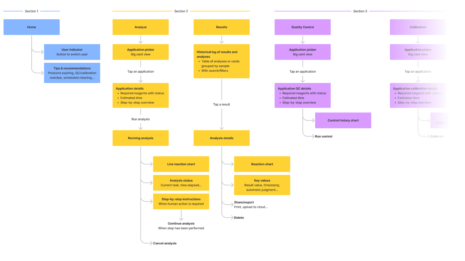
Based on the briefing and the new analyser’s feature list, I created an information architecture to structure the menu hierarchy. In parallel, I started wireframing the most important screens, asking for feedback and iterating.
A coagulation analyser is a complex device with many features that need to be quickly accessible. It needs to account for every situation to prevent errors that affect the patient. After seeing architectural issues with competing analysers, I wanted to reduce the amount of rarely used buttons in the main navigation, and create distinct flows and screens for routine tasks, such as calibration and inserting patient samples.
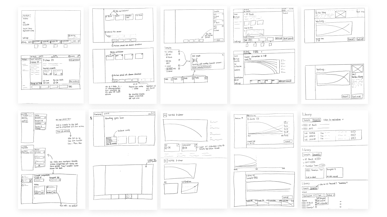
My paper wireframes were turned into low-fidelity mockups early, once again for quick feedback and iteration.
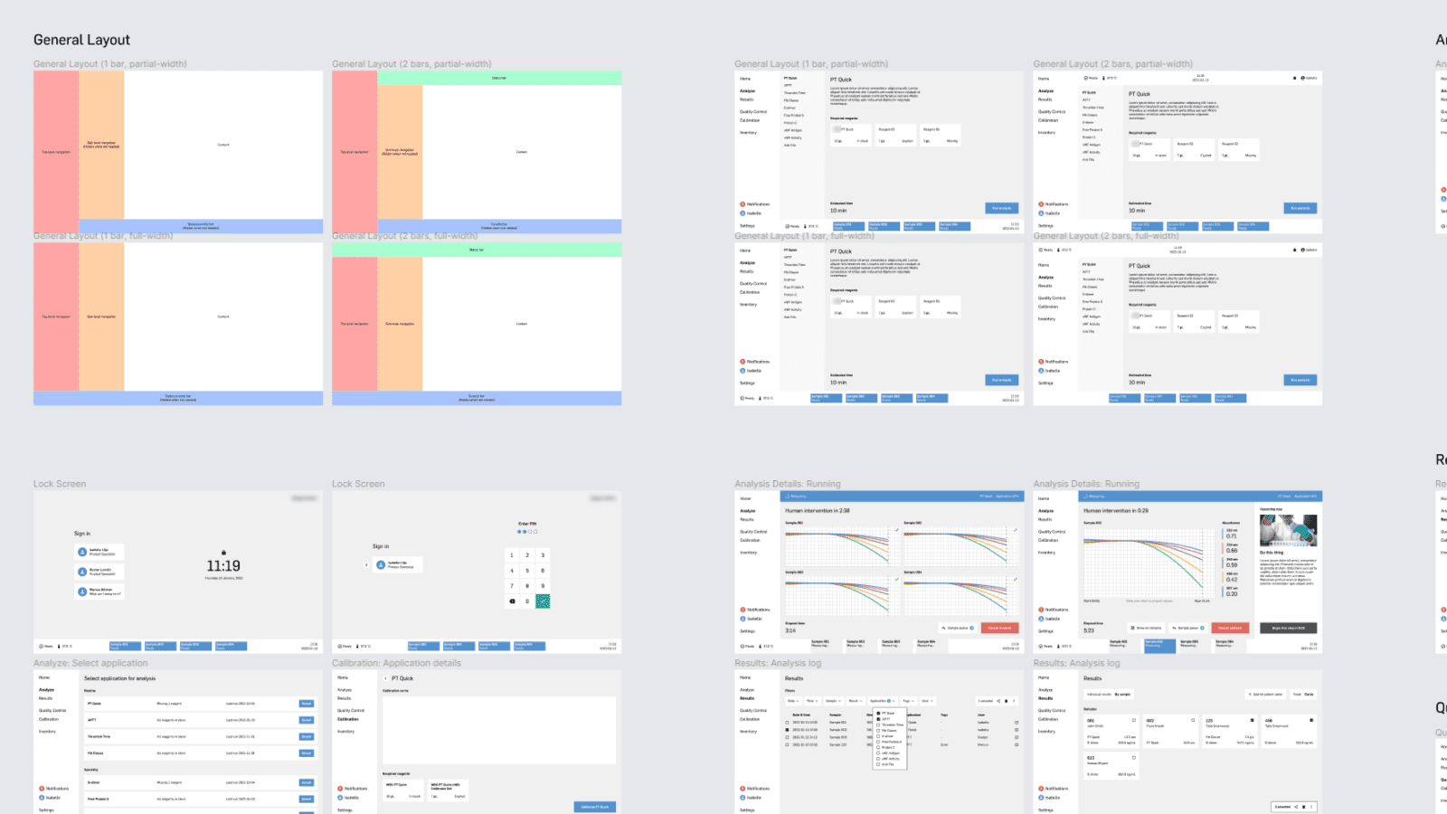
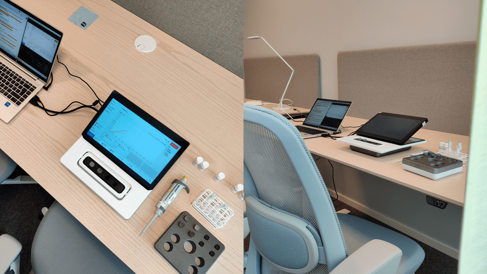
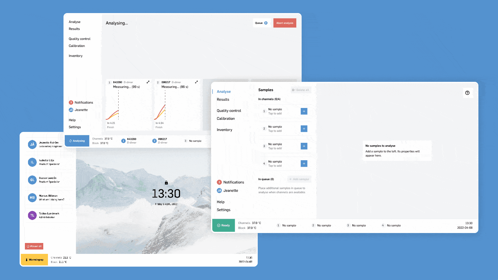
I decided to use a left sidebar for the main navigation, as this is the most efficient use of screen space on a landscape-oriented screen, provides quick access, and is commonly seen in modern web apps. The bottom status bar displays the analyser’s status and currently inserted patient samples, which visually line up with the four physical slots on the analyser.
User tests
Towards the end of the project, I planned and performed two rounds of user tests with two groups of lab staff. My scripts covered all core functionality with focused yet open-ended tasks that encouraged natural usage rather than leading the test subjects to the answer.
In front of the test subjects was a realistic interactive prototype on a touch screen identical to the one on the future production unit. A physical prototype of the analyser and real lab equipment was used for extra realism and context when simulating lab tasks.
From the user tests, I collected over 100 points of feedback that I ranked by impact and suggested solutions for. I implemented around 60% of these fixes, while the rest was left for future designers to evaluate as these needed more judgment and testing than I had the time or resources for.
Result
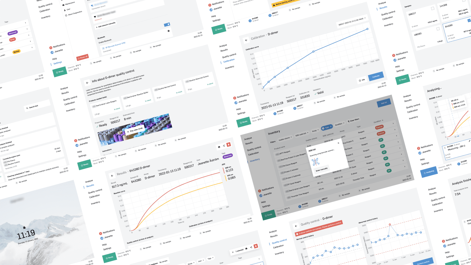
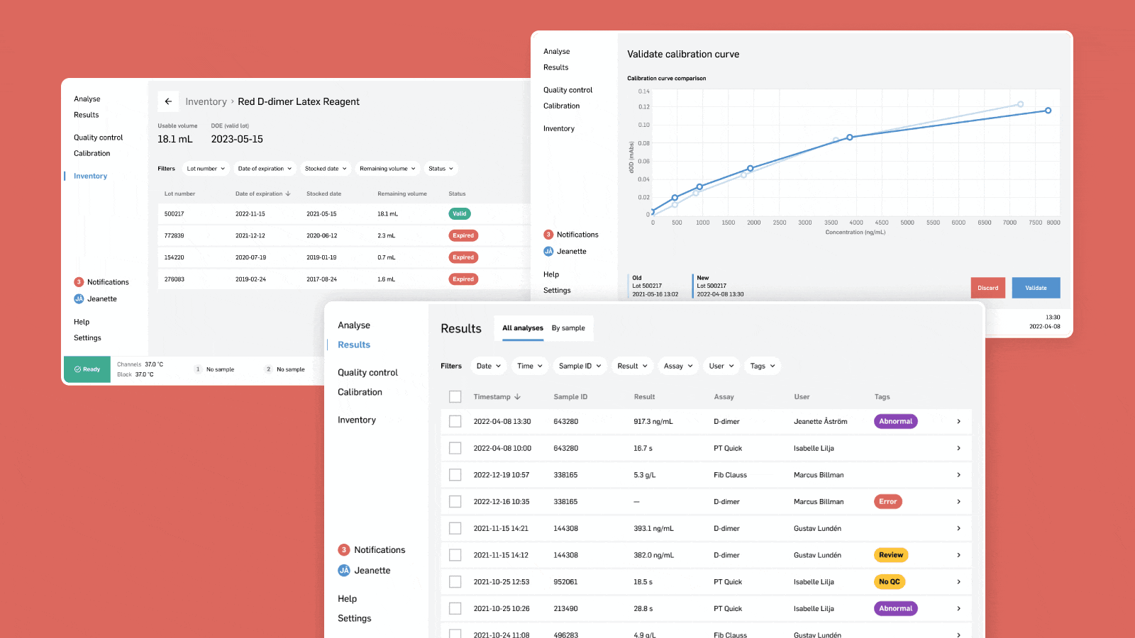
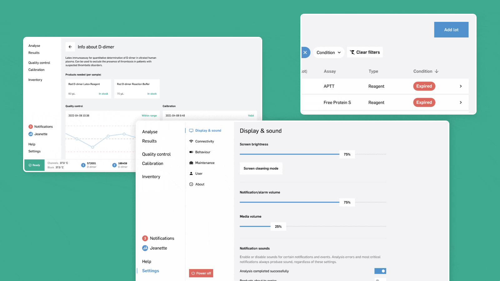
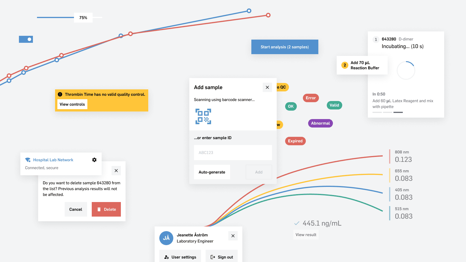
The result is a well-structured, straight-to-the-point UI that guides lab staff through a plethora of routine tasks. The visual language is simple, crisp, and communicates clearly through consistent use of colour.
Interactive charts and clear graphics take advantage of the large touch screen for quick scannability in the lab. Step-by-step instructions, video guides and clear warnings help prevent mistakes, and the status indicator in the bottom left always shows what the analyser is doing.
Conclusion
The company was more than satisfied by my UI proposal, which was in line with their vision for the product. Although the UI isn’t ready for customer release, the company now has a base from which they can develop robust software and make future design decisions.
This was the largest design project I’ve worked on. In addition to the actual design work, I also practised my communication, planning and documentation, among several other skills such as aggregating user test data into spreadsheets. In the end, my internship was incredibly rewarding and I learned a ton.
It feels fantastic to have played a significant role in the development of a product that will help save lives in the future. I firmly believe in this device and the impact it can have on healthcare, especially in poorer regions. I look forward to seeing how the analyser is further developed and received around the world.