Introduction
Whether for social media, banking or streaming video, we use screens a lot. Different apps and websites can look quite different, but one idea that’s stuck around in recent years is dark theme. Instead of the traditional black text on a white background, the opposite is used. According to some, this is more comfortable to read, but what usability difference does the colour theme make for high school students on the web?
Methods: Website and survey
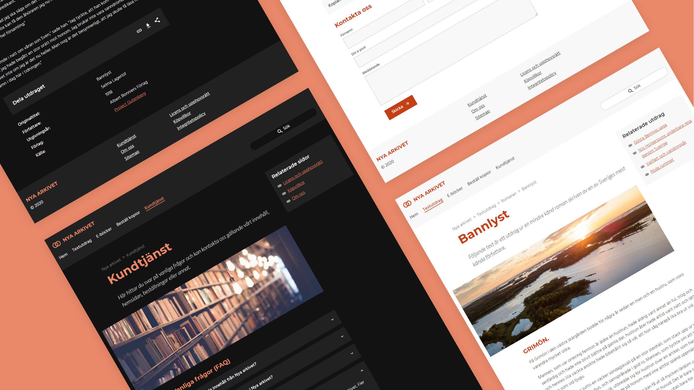
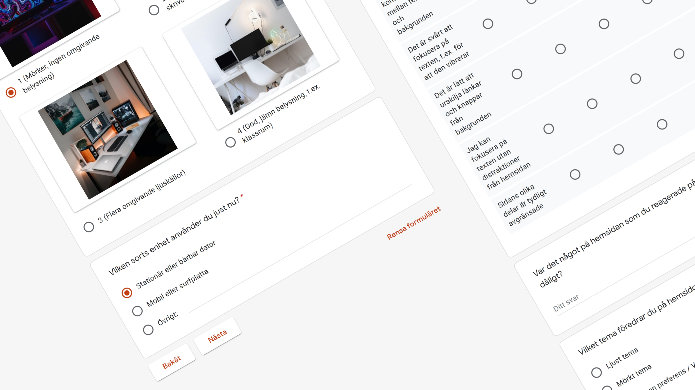
A test website with a light and dark variant was created. Half of the participants were presented the light version and the other half saw the dark one. The participants answered a survey collecting thoughts about their variant of the website. Some also participated in interview-like user tests that involved tasks such as reading, finding links and filling forms. The two colour themes were then compared to find patterns and a possible winner.
Results: Everyone wins!
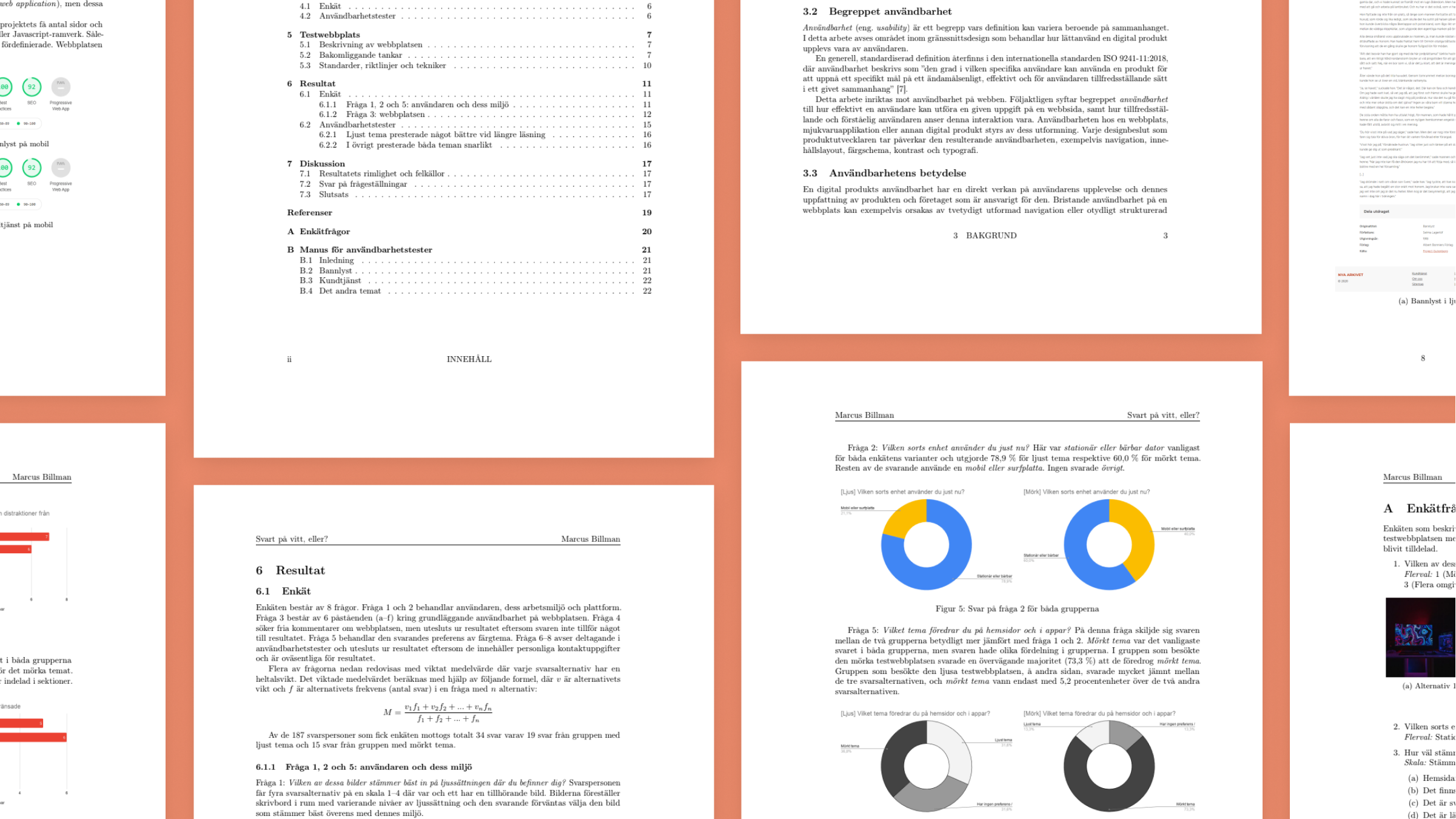
The survey found that the dark website was perceived as slightly more appealing among the participants and the majority generally prefered dark apps and websites, which may be related to the fact that most were in dark rooms when answering. The website's light and dark variants were both perceived as clearly structured, comfortable to read and non-distracting, but dark theme had the edge in certain aspects.
In the interviews, though, light theme users read on average 21% faster than the dark theme users, and light theme users also performed better when recalling what they’d read. However, reading speed also differed significantly between the users of the same color theme, which is likely due to varying reading habits rather than the color theme itself. The remaining tasks, such as finding links or filling a contact form, were done equally well on both themes.
Discussion/conclusion
Participants of the survey did lean towards the dark theme, but not enough to mark it as a clear winner. My conclusion is that a website's readability and usability are significantly more affected by the user's literacy, habits and environment than by the color theme of the website, assuming the website is usable overall. People's preferences differ and therefore no single color theme wins over the other, but instead user choice takes the cake.
- Date
- 2020–2021
- Skills used
- UX research •
- Web design •
- Front-end development •
- Public speaking •
- Scientific writing